UX Properties
Description
The UX component contains the following types of properties:
- Name
- Description
- UX Properties
UX properties include:
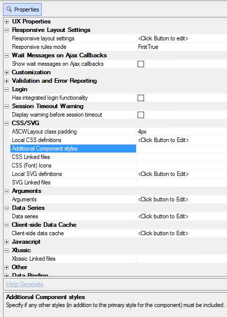
- Responsive Layout Settings
The term responsive layout is commonly used to describe a layout that changes automatically depending on the screen size or screen orientation of the device that you are running on. For example, if you have a mobile device that has a relatively small rectangular screen, you might want the layout of the controls on that screen to change when then device goes from being held vertically to being held horizontally.
- Wait Messages on Ajax Callbacks
Settings for adding a wait message to the UX Component that is shown when a callback to the server is made.
- Customization
Customization properties include.
- Validation and Error Reporting
Properties for implementing and styling the validation and error reporting in an application.
- Login
The UX Component can include integrated login/logout functionality. This means you don't have to use a separate Login Component, or (AppLauncher with login turned on) to authenticate users in your application.
- Session Timeout Warning
Add a session timeout warning that notifies the user when their session will expire. If Alpha Anywhere's security system is enabled, the user may be required to login again after their session expires.
- CSS/SVG
Properties for using cascading style sheets and scalable vector graphics in a component.
- Arguments
Define arguments. Arguments can be bound to page, session and cookie variables. Argument values are passed into all server-side Xbasic event handlers in the component.
- Data Series
Settings for creating and defining data series used by controls in a UX Component.
- Javascript
Javascript properties allow you to define external Javascript libraries and files that are used by the UX Component. You can also create Javascript Actions: client-side code created with Action Javascript that can be called throughout the UX Component.
- Xbasic
here...
- Other Properties
Other properties include:
- Data Binding
Data binding is exactly what the name implies, joining data from an existing or created table to a given UX component. Data can also be bound to a control as, for example, when detail view containing textbox controls is bound to list control that is in turn bound to a SQL table on a server. You can visit the main [Data Binding] page for more information and guides on how to implement data binding. The properties in this section are for UX components that have already been data-bound.
- Optimizations
Options for improving the performance of the UX Component when it is loaded from the Web Appication Server.
- Panel Layout HTML
Determines when the HTML for Panels is computed.
- Local Storage/File System Storage
Configure the namespace information, data compression, additional data to persist, and debugging behaviors in working preview for the data persisted to Local Storage (or the file system) for an application.
- UX Advanced Properties
Advanced properties for the UX Component
- Application Cache
Properties for configuring the UX Component to use the Application Cache for building offline web applications.
- Real-time Applications using the Pusher Service
Add messaging to your application with the Pusher service.
About the UX Properties Page
The UX > Properties Menu defines the formatting for the UX, including the style sheet, and enables some special features.
The menu is divided into sections, with each section describing related property settings. Whenever a property is highlighted, a short description of what the property does will usually appear at the bottom of the screen